About project
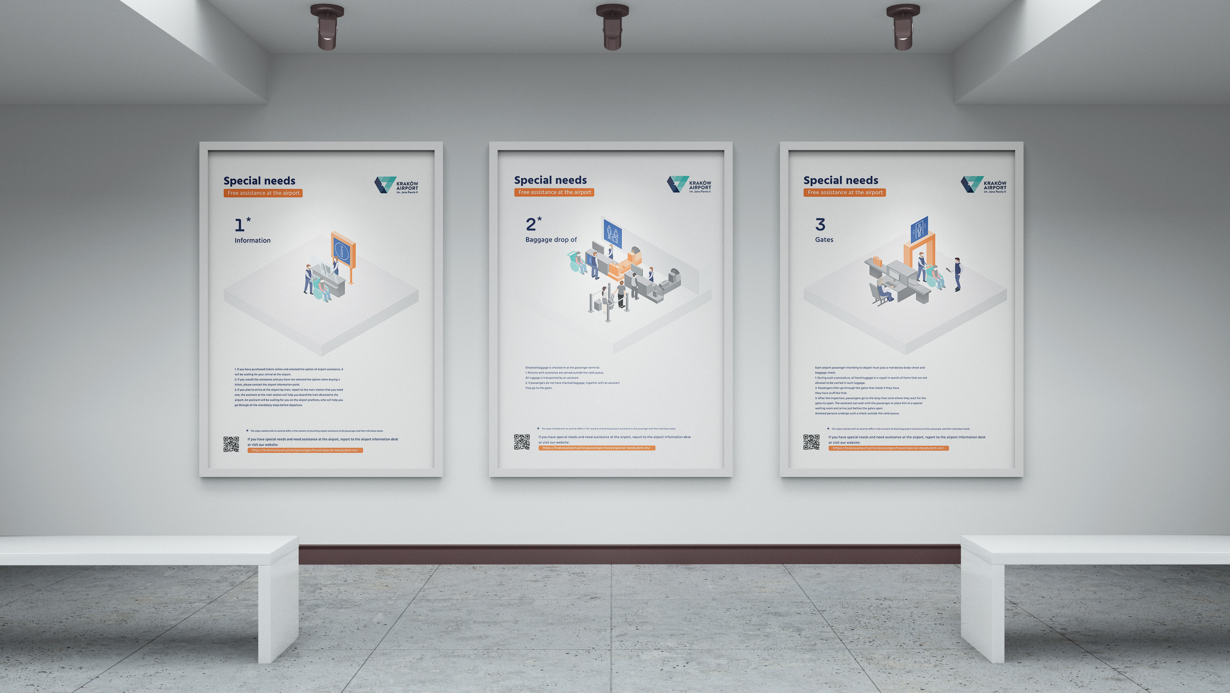
The project was made in the Department of Visual Communication A under the supervision of Dr. Barbara Widłak and Ms. Agnieszka Juchy-Kasperczyk. The project aimed to create a wayfinding system primarily for individuals with intellectual disabilities and foreigners, recognizing that the inability to communicate is a form of disability. The design focused on simplicity and clarity. Simplicity was essential due to the recipients’ lack of understanding of complex things and a lack of abstract thinking; the signs should leave no room for doubt during reading.
Throughout the project, tests were conducted with individuals with varying degrees of disability, leading to decisions made in the project and the selection between different versions of informational signs. The project also involved collaboration with Krzysztof Kiepura from the ForEdu foundation.
Conteptual sketches
In the initial phase of the project, my goal was to generate as many concepts/variants as possible to choose the best ones from the resulting set. About 50 sketches were created for each of the 31 signs. The illustration below presents the process of creating the selected sign. I started by sketching ideas on paper, a rapid generation process without a grid, to focus on construction solely on the idea. Then, I moved on to tracing the generated ideas on paper with a grid. The final stage of creating the sign involved vector drawings in graphic design software.
Tests with people with disabilities
The final phase of the project included readability tests of the prepared sign set. Thanks to the generosity of Krzysztof Kiepura from the ForEdu foundation, these tests were conducted with individuals with various degrees of intellectual disabilities. The test results influenced decisions made in choosing versions for 2 signs. I had doubts about the elevator and check-in signs. Simplicity and literalness were decisive factors in the selection process.
Icon construction
In constructing the signs, I used a construction grid. I aimed for the signs to be gentle and subtle, which led me to choose rounded lines and edges for the shapes. I strived for one sign to flow into another, as exemplified by the airport sign, departures, arrivals, and the arrow sign where a repeating shape builds them all.
Color choice
I decided to choose a rather subdued color palette consisting of four main colors: a gentle shade of blue, a muted and pure white, as well as a stronger, dark broken color.
